
A full rebuild of a 50-year-old family entertainment center's website, from pricing chaos and zero mobile support to a mobile-first, brand-true system built to actually convert.
The original site was built when I was a teenager, back when web carousels were everywhere. The original developer fully embraced that trend: the site was made almost entirely of hyperlinked image carousels. The General Manager, who also handled the site's design assets, followed a "more is more" philosophy.
It worked in the early days. By 2025 it overwhelmed users with visual fatigue, and had zero real mobile support. The entire site simply scaled down to phone width, images and all.
My goal was a framework that naturally prevented clutter instead of fighting it page by page.
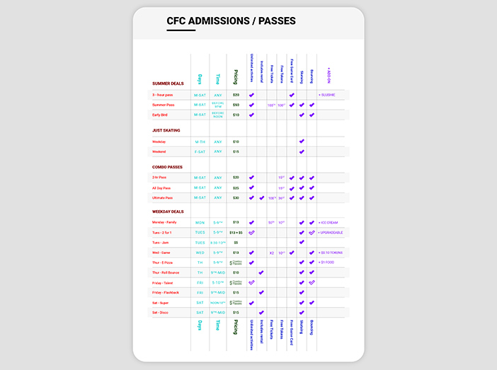
Before touching the interface, I sat down with the GM and asked a mountain of questions. When I asked how much it actually costs a regular family to visit, he paused. He realized he was probably the only person on the planet who knew.
So I mapped out every pricing structure a regular customer could hit: an average person walking in on a random day at a random time. The answer? At least 18 different price points. Which is absolutely bonkers.
The GM was both impressed and horrified when I showed him the chart. He shared it with the franchise owner, who didn't seem fazed at all, which I thought was hilarious.
The goal of the exercise was simple: understand the customer experience well enough to design an interface that eliminates confusion and friction, instead of adding to it.
The next questions were about purpose: what the site needed to do now and in the future, what worked, and where it struggled. The primary issue was mobile: the site had no real support for it at all.
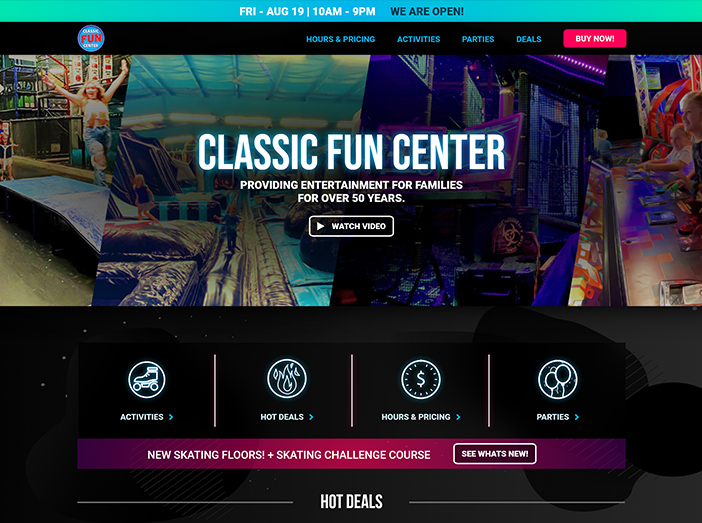
I designed a "hotbar" linking to the most-used sections (Activities, Hot Deals, Hours & Pricing, and Parties) with a contextual promo banner underneath for a "what's new" signal. Both the Hot Deals and Today's Deals components are dynamic, updating daily to reflect the many pricing and event specials, which was a huge upgrade over the old static carousels.
The goal was for users to reach whatever they needed within two clicks. Outside of party booking, which has real complexity to walk through, we nailed it.
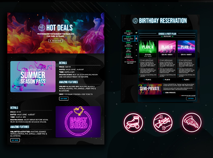
Those were the GM's words for the vibe he wanted. I thought immediately of black and grey-blue gradients contrasted with bright neon, put together several moodboards to get buy-in, then built a full brand guide with web components on top of it.
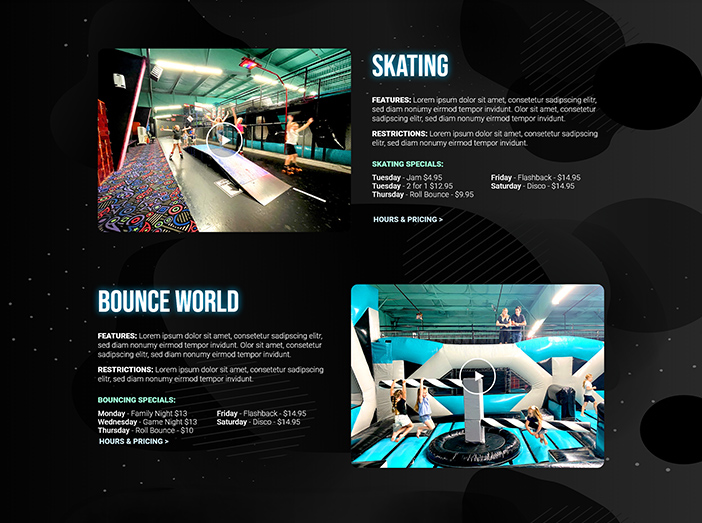
I wanted every asset on the site to feel like it was built exclusively for Classic. Without visual clutter, every deal and event still needed to stand out with its own personality. In the end I designed over 96 custom icons for use across the site, and spent a couple of Saturdays at Classic shooting hero photo and video content with my own family and friends.
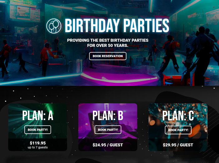
Booking a party requires a ton of information, which creates plenty of opportunity for drop-off and frustration. My developer and I broke registration into seven clear steps, each with built-in error handling, fail-safes, and helpful tips, so users always know their options, costs, and what happens next.
Designing it was one thing; bringing it to life in code was a whole different challenge, and my developer nailed the execution.
Speed matters. People want to get in and out. The faster they find what they need, the happier they'll be.
Minimalism isn't the default answer. Sometimes a site should reflect the unique, vibrant energy of the business it represents, not sand it down.
Great developers make great products. Working closely with developers pushes creative boundaries and keeps ideas grounded. Knowing when something's too complex for its payoff matters as much as dreaming big.